


Now Reading: 21 macOS Tahoe Icons Reveal Your Mac’s New Look This Fall
-
01
21 macOS Tahoe Icons Reveal Your Mac’s New Look This Fall
Quick Summary
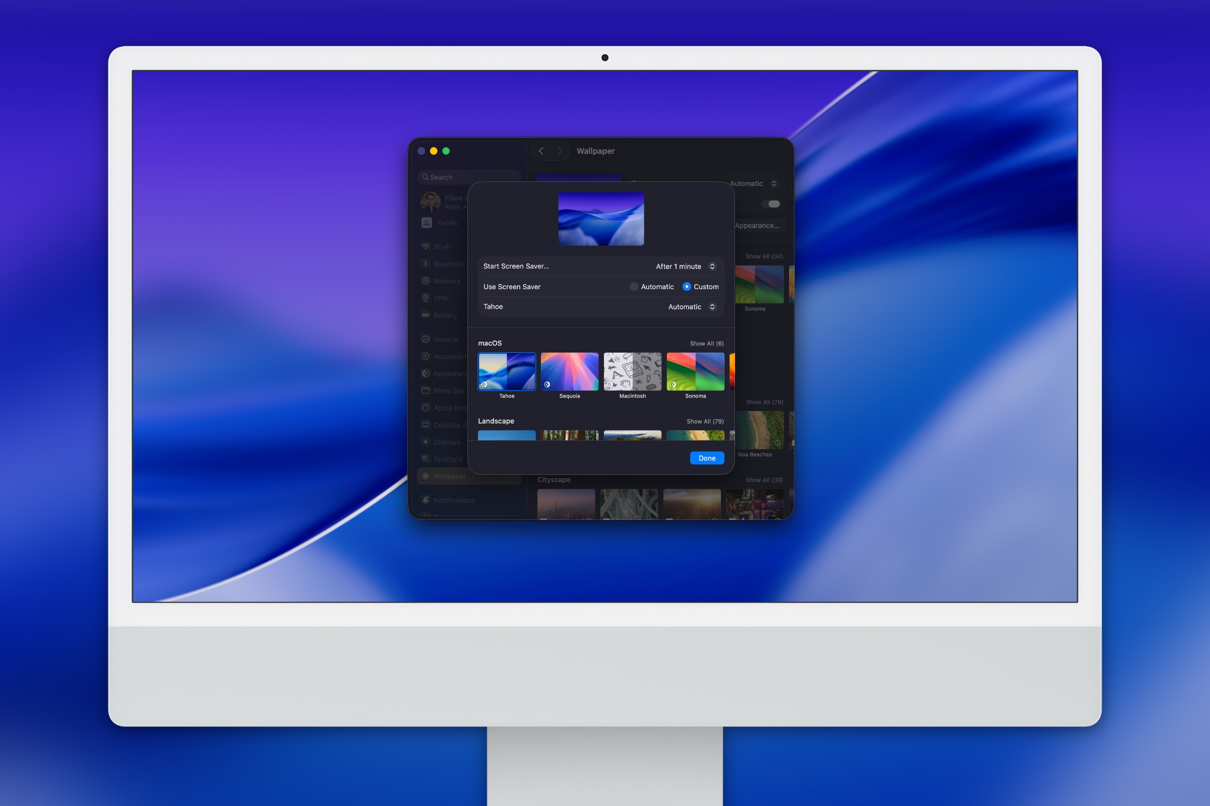
- Apple is introducing redesigned icons in its upcoming macOS Tahoe update, alongside the new Liquid Glass interface.
- The changes aim to give macOS a fresh look, with some icons remaining recognizable while others appear drastically simplified.
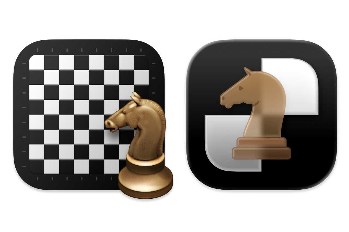
- A comparison of 21 updated app icons from macOS Sequoia (left) to macOS tahoe (right) reveals design shifts in Finder, Calendar, Chess, Terminal, Screenshot, and other applications.
- In many cases, the newer designs adopt simpler aesthetics but sacrifice character and complexity compared to previous versions.
Images:
!Finder: macOS Sequoia (left) and macOS Tahoe (right)
!Chess
!Calendar
Indian Opinion Analysis
The redesigned iconography introduced by Apple highlights its ongoing effort to innovate aesthetic elements alongside functionality. While the adoption of simpler designs aligns with modern UI trends emphasizing clarity and minimalism, parting ways with intricate or character-rich visuals may elicit mixed reactions from users accustomed to existing designs.For Indian Mac users-especially graphic designers and tech enthusiasts-the visual redesign could have implications for workflow familiarity.India’s growing base of creative professionals often relies on intuitive user interfaces; therefore such changes might trigger an initial learning curve but eventually assimilate as part of Apple’s larger ecosystem shift.
Apple’s consistent effort toward providing visually cohesive experiences reinforces its leadership in hardware-software integration globally and locally for India’s evolving digital landscape. users reacting positively or negatively will largely depend on individual preferences rather than systemic usability issues.


Related Posts

Stay Informed With the Latest & Most Important News
Previous Post
Next Post


Advertisement


