Now Reading: 5 iOS 26 Liquid Glass issues that Apple needs to fix before launch
-
01
5 iOS 26 Liquid Glass issues that Apple needs to fix before launch
Iâve been using and testing Appleâs iOS 26 Liquid Glass design on the iPhone ever since iOS 26 beta 1 was released, and Iâm happy to report that it didnât take me long to get used to the new design language. However, I did warn you that the new design might be a good reason to skip testing iOS 26 beta 1 on your own iPhone.
The Liquid Glass UI is exciting to look at, and I can see why Apple is building the design into all of its operating systems. That said, thereâs no way to fully deactivate it. You can reduce the transparency, but that setting applies to the entire iPhone.
After days of using an iPhone running iOS 26, Iâve come to realize that I want Apple to make certain tweaks to the transparency of the iOS 26 design. Also, I think Apple might want to rethink the usability of the iPhone. Itâll take a while for longtime iPhone owners to get used to the simplified menus and find everything. I canât even imagine what someone who struggles with iOS 18 will go through once they inevitably update to iOS 26.
Why Apple needs Liquid Glass
I explained more than once that the redesign signals that Apple is preparing its software to run on new device categories. Apple wants to offer customers a familiar user interface across devices, whether itâs an iPhone, iPad, Mac, or Vision Pro.
The fluidity of Liquid Design should also make it easy for Apple to switch between iPhone/iPad and iPad/Mac experiences on the upcoming foldable iPhone and foldable iPad. More importantly, the new, transparent look ensures that iPhone users are accustomed to Liquid Glass long before the first AI/AR smart glasses from Apple arrive.
A look at the following image is enough to understand where weâre going:
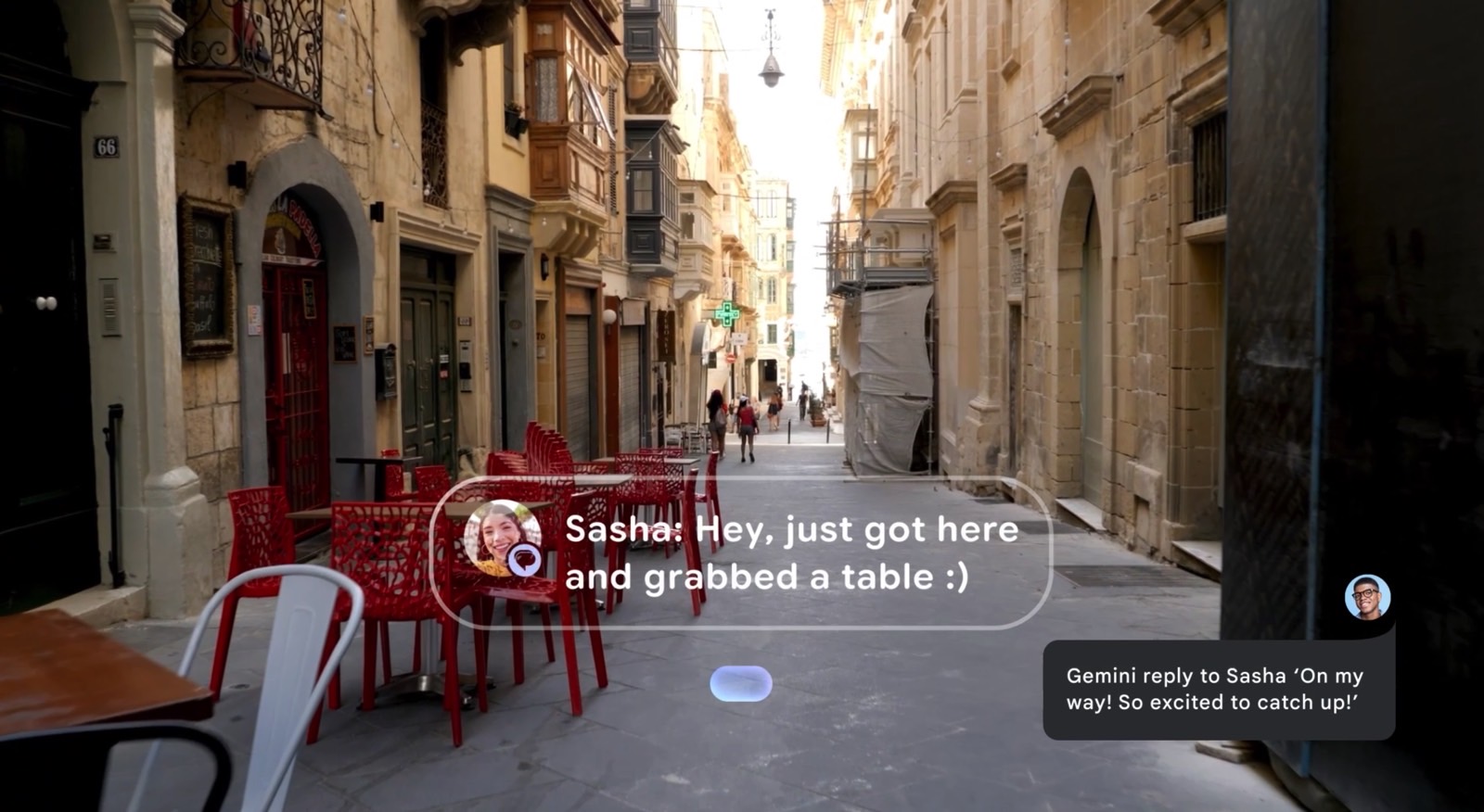
The image above is a look at Android XR. We see a person using AI/AR smart glasses to read an incoming message and instructing Gemini to respond.
The digital UI elements form a layer that is projected on top of the real world. You still have to see the real world when wearing AR smart glasses, so the UI has to have some transparency. Liquid Glass prepares us for that future.
Problems with Liquid Glass
However, the Liquid Glass experience in iOS 26 beta 1 isnât that great, and I say that as someone already testing the new OS. Below, Iâll show you a few of the big problems that Apple needs to fix by September.
Notifications on the Lock Screen

Transparent menus are amazing to experience in iOS 26, but they donât work everywhere. The Lock Screen is one place where the Liquid Glass experience is terrible. Itâs difficult to read notifications, especially if you have a bright background.
The poor contrast will make it a lot harder for older people and those suffering from eyesight conditions to read notifications. Lock Screen widgets might have the same problem, especially those that have text overlaid on a bright wallpaper.
The solution shouldnât be having to change your wallpaper. Instead, Apple should give us a new setting to handle the glass opacity of notifications on the Lock Screen. Again, the accessibility option to reduce transparency currently applies to the entire UI.
Control Center
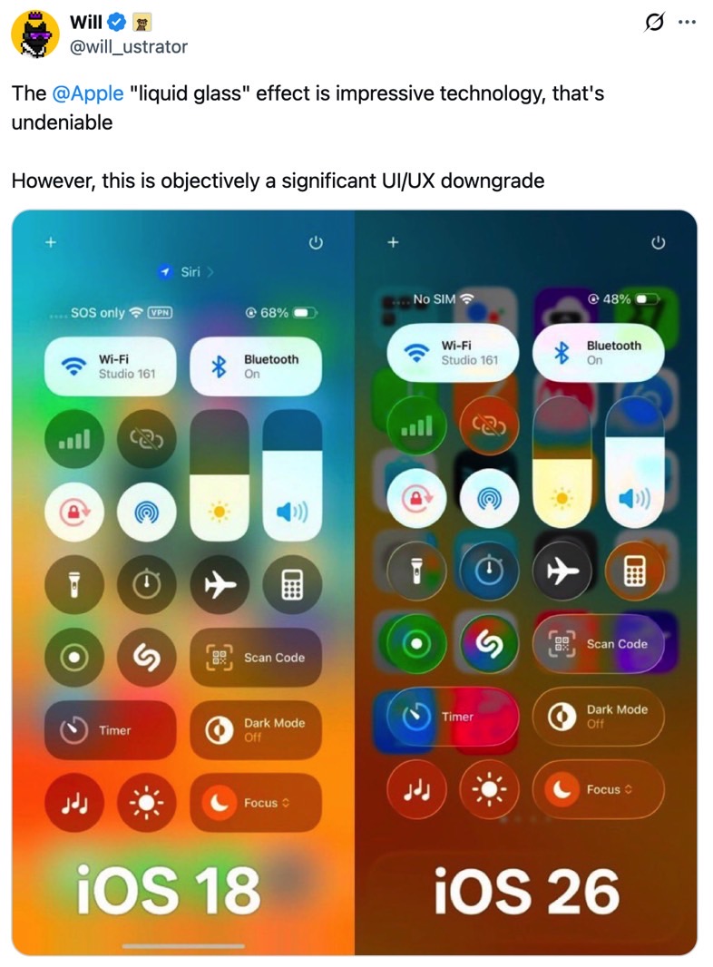
The Control Center is an even bigger visual mess. Iâm a longtime iPhone user and I customize my Control Center experience. I know where to find the settings I need to tweak. I can find the buttons even if the background makes it harder to see them.
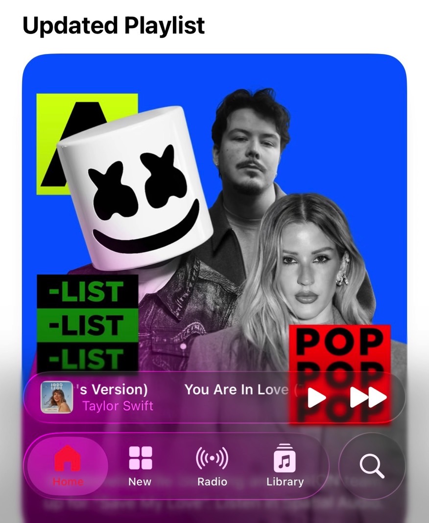
But some people will have problems telling the Control Center buttons apart from the background. Also, seeing all the layers of the iPhone like that gives me anxiety. Everything is too crowded, overloading my senses. Something similar happens in the Music app, and I donât like it one bit.
I prefer the blurred background of iOS 18, something Apple should consider for Control Center in iOS 26. We donât really need that much transparency here.
One thing thatâs great about iOS 26 app menus is that theyâre much simpler than before. They donât take up the entire bottom of the screen, which means you get to see more content. But that means Apple had to hide menu options in its attempt to simplify them.
The Music app (above) is a good example. I struggled to find music saved in my Library as I was going back and forth in the menu.
The same applies to the Health app. This time, the transparency isnât the problem. Itâs the unintuitive âSearchâ icon that contains everything in the app. Iâm searching for something specific, but the search icon doesnât fit here. I associate it with online search or device search. It took me a while to realize that was the button to press to find what I was looking for.
The same search button confused me in the Music app. Switch to Safari and youâll find a three-dot button instead of search.
Blurry app icons
Back to the Liquid Glass design, I have another issue with the transparency effects. This time, it concerns app icons. Hereâs a zoomed-in look at the Photos icon, where you can notice the layers of glass. It looks good like that.
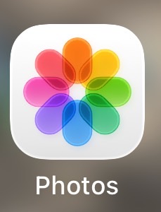
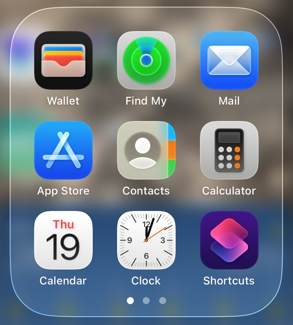
But you donât see the zoomed-in version of the icon while using your iPhone. Instead, youâll see something like this, which distorts the glass effect:
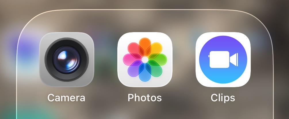
Now, the icon looks blurry to me. Itâs out of focus. It doesnât look good. I feel like I need to clean the display, as my brain tells me it must be dirty.
The same applies to other Apple apps that feature layered images. Find My, Mail, and the App Store are some examples of that.
And yes, I tried the completely transparent app icon design. I canât handle it. Itâs too much.
App icon design isnât as big of an issue as the appearance of notifications on the Lock Screen. Some people might even like the Liquid Glass icons. Iâd love an option to reduce transparency just for the icons, though, which currently isnât available.
Disappointing battery life
Unsurprisingly, battery life took a hit after I updated my iPhone 14 Pro to iOS 26 beta 1. It happens with early betas, and my iPhone is approaching its third birthday.
But Iâm starting to wonder whether the Liquid Glass design in iOS 26 is impacting battery life. I disabled motion in iOS years ago, but all the transparency and the way that iOS 26 handles light could theoretically impact my phoneâs battery life.
Weâll need in-depth battery tests to see how much battery life Liquid Glass consumes. After all, using the always-on display also consumes energy. But thatâs an optional choice. Liquid Glass isnât. A fix here would be the option to turn off transparency completely.


Related Posts


Stay Informed With the Latest & Most Important News
Previous Post
Next Post


Advertisement